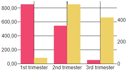
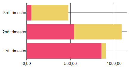
Bar Graph 2
Qubes 9.0 Bar chart 2 graphic component.
Properties
| Property | Description |
| AxisFormat | Data-axis display format (numeric, date). You can also define your format in greater detail (such as '%.2f', ¤mm/dd/yyyy, etc.). |
| AxisMax | Maximum value of the y-axis. |
| AxisMin | Minimum value of the y-axis. |
| Data | List of numerical data associated with the data labels. If there is more than one series, the lists of values for each series must be separated by at least one "-". Empty and non-numerical values will be considered as 0s. For each series, if there are more values than there are data labels, only the first values will be used. If there are fewer, a 0 will be assigned to the data labels with no values. |
| DataLabels | List of data labels. |
| Enabled | Boolean indicating whether or not the component is enabled. |
| Hint | Specifies the user hint string that will appear in the component's interactive help bubble. |
| LabelFormat | Format the labels displayed. auto autodetect the type of label displayed. You can define your format like ¤mm/dd/yyyy to format the labels as dates. (Qubes 10.0) |
| Legend | How the legend is displayed. auto displays the legend inside the graph, according to standard formatting rules. "" displays no legend. If you want the legend to be displayed in a legend component, you will need to indicate the name of that legend component. |
| Orientation | Orientation of the graph: horizontal or vertical. You can add -reverse to change the starting point of the values (from top to bottom or from left to right instead of from from bottom to top or from left to right). horizontal is the default value. |
| SeriesAxis | Series anchor axis: left or right. |
| SeriesColors | Graphic elements of the series. If there is more than one series, you will need to provide a list containing a value for each series. |
| SeriesModes | Series display mode (grouped or stacked). grouped is the default value. |
| SeriesNames | Series name(s). If there is more than one series, you will need to provide a list containing a value for each series. |
| Style | Advanced and optional style properties for the graph. When specified, it must be a list of keys and values. Learn more about its syntax and possibilities at Graph Style Property. |
| ValueInitial | Determines the component's initial value when the screen opens and each time it is reset (see Reset Button). |
| Visible | Boolean indicating whether or not the component will be visible. |
Value
(Qubes 10.0)
Returns a String which is an encapsulated JSON Object with the data of the last clicked bar.
The encapsulated JSON contains :
- barColor: String, color of the bar;
- barIndex: Integer, index of the value / label starting from 0;
- label: String, label of the sector;
- seriesIndex: Integer, index of the series starting from 0;
- seriesName: String, name of the series;
- value: Float, value of the bar;
Remarks
Syntax of Colors: startColor [opacity];[barOutlineColor];[barSize];[barOulineSize].
Colors must be in hexadecimal.
For example:
- #000000 0.5. This will display the bars in the series in black, with an opacity of 0.5.
- #000000 0.8; #CCCCCC;; 2. This will display the bars in the series in black, with an opacity of 0.8, a grey outline color with a size of 2.
If Orientation is set to horizontal or horizontal-reverse: left and right in SeriesAxis will correspond respectively to the bottom and the top X-axis.
To use Unix Time Stamp with milliseconds (that can be obtained with UnixTimeMsec), your value needs to be decimal where the decimals are the milliseconds of your value. (For example : UnixTimeMsec() which returns 1632150863281 has to be 1632150863.281 for the component).
If the graph is located inside layers whose Visible property is dynamic, it is recommended to set the graph's Enabled to false to avoid undesired behaviour with mouse events.
If you want to force a line return in the labels, you have to add <br> inside your String.
It is possible to zoom in on the graph.
To do that, simply select the area on which you want to zoom. To revert it to its original size, click anywhere in the graph.
The position of the legend inside the graph is defined by the cell alignment.
The only supported fonts currently are : "Arial", "Balto", "Courier New", "Droid Sans", "Droid Serif", "Droid Sans Mono", "Gravitas One", "Old Standard TT", "Open Sans", "Overpass", "PT Sans Narrow", "Raleway", "Times New Roman". Any other font applied to this component will be interpreted as "Times New Roman".
This component does not require Internet access, but does need a browser that supports HTML5 Canvas. In practice, all modern browsers but Internet Explorer 8 and below support it.
Examples
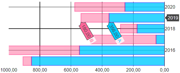
The following settings were defined to generate the above stacked graph:
- To indicate series' names:
SeriesNames=List('A', 'B')
- To specify the colors of the two series:
SeriesColors=List('#00ccff 0.8; #3366ff;; 2', '#ff6699 .5; #ff0066;; 2')
- To define the display formats for the axis:
AxisFormat=%.2f
- To define the display horizontaly the graph, from left to right:
Orientation=horizontal-reverse
- To define the display mode of the graph:
SeriesMode=stacked
- To define the axis max :
AxisMax=1000
- The component was left to determine the axis min:
AxisMin=auto
- The component was left to use its own integrated legend:
Here the graph is centered.
Legend=auto
- The component style wasn't modified:
Style=''
- The component was left to chose the default axis:
SeriesAxis=''
- The series data defined:
Data=List(List(854, 546, 54, 176, 356, 254),
       '-', List(54, 542, 422, 106, 180, 322, 376)
     )
- The series data labels defined:
DataLabels=List('2015','2016','2017','2018','2019','2020')