Drag-Drop List
Qubes 10.0 Drag-Drop List component.
Properties
| Property | Description |
| Enabled | Boolean indicating whether or not the component is enabled. |
| GroupName | Name of the component's group. It allows to drag and drop elements to another Drag-Drop List component that has the same GroupName's property value. |
| HasLabels | Boolean that indicates if each item of the ValueInitial's list is immediatly followed by it's associated labels. |
| Hint | Specifies the user hint string that will appear in the component's interactive help bubble. |
| Theme | String that indicates the theme to apply to the elements of the list. Accepts only a lowerCase alpha-numeric string and "-" character. Values that don't respect this rule are interprated as "default". |
| ValueInitial | List of values that can be interlaced with labels if GroupName property is set to true when the screen opens and each time it is reset (see Reset Button). |
| Visible | Boolean indicating whether or not the component will be visible. |
Value
The component's value is a list of values that are on the list in the same order.
Remarks
If HasLabels is set to true then the list specified for ValueInitial is interpreted as List(value1, label1, [...], valueN, labelN).
The component doesn't show empty values or values with empty labels (if HasLabels=true).
This component is compatible with smartphones, tablets and other portable devices.
However, it can lead to some undesired behaviour with other touch events. It is recommended to use it only to transfer elements from a list to another as reordering the elements can be complicated due to scroll events.
Moreover, elements with a width superior of 300px can lead to some strange appearance when dragged due to browsers' implementation.
It can be used to reorder a list of items or to populate another list.
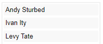
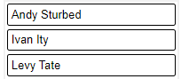
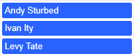
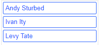
Theme Property
The component currently embed the following themes:
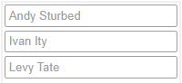
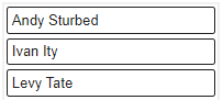
- default - Default theme that uses the font properties of the component's cell.
- default-outline - Transparent background with a border that uses the font properties of the component's cell also for the border.
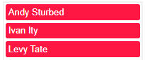
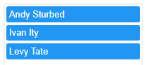
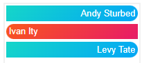
- primary - Dark blue background and white font.
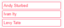
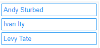
- primary-outline - Dark blue font and border, transparent background.
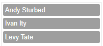
- secondary - Dark grey background and white font.
- secondary-outline - Dark grey font and border, transparent background.
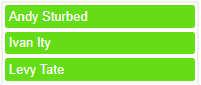
- success - Green background and white font.
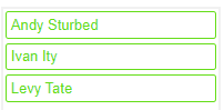
- success-outline - Green font and border, transparent background.
- danger - Red background and white font.
- danger-outline - Red font and border, transparent background.
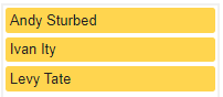
- warning - Yellow background and black font.
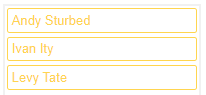
- warning-outline - Yellow font and border, transparent background.
- info - Blue background and white font.
- info-outline - Blue font and border, transparent background.
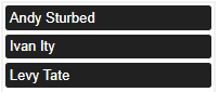
- dark - Black background and white font.
- dark-outline - Black font and border, transparent background.
- fancy - White font, colorful animated background, shaped elements. Rainbow animated background and shaking element on hover.
To use a custom theme, give a name different than those listed above. Then, use an ornament to customize the component.
As the theme adds a class (named "cit-ddl-" + "your-custom-theme") to the element, you can use it to target specifically the component.
For example, by using this inside a ThemePack:
{
    "name": "custom-primary-theme",
    "css": "div.cit-ddl-custom-primary-theme > div.citDDLDropZone div { background-color: #2962ff; color: white; }"
},
{
    "name": "custom-primary-outline-theme",
    "css": "div.cit-ddl-custom-primary-outline-theme > div.citDDLDropZone div { background-color: transparent; color: #2962ff; border-color: #2962ff; border: 1px solid; }"
},
{
    "name": "custom-fancy-theme",
    "css": "div.cit-ddl-custom-fancy-theme > div.citDDLDropZone div { color: white; background-size: 400% 400%; animation: cit-ddl-custom-fancy-theme-frames 10s ease-in-out infinite; } div.cit-ddl-custom-fancy-theme > div.citDDLDropZone div:nth-child(odd) { background: linear-gradient(-45deg, #ff6f00, #e91e63, #03a9f4, #1de9b6); border-radius: 0 1em 1em 0; text-align: right; background-size: 400% 400%; } div.cit-ddl-custom-fancy-theme > div.citDDLDropZone div:nth-child(even) { background: linear-gradient(-45deg, #1de9b6, #03a9f4, #e91e63, #ff6f00); border-radius: 1em 0 0 1em; text-align: left; background-size: 400% 400%;} div.cit-ddl-custom-fancy-theme > div.citDDLDropZone div:hover { background: linear-gradient(-45deg, #ff1744, #ff9800, #ffeb3b, #64dd17, #00b0ff, #651fff, #00b0ff, #64dd17, #ffeb3b, #ff9800); animation: cit-ddl-custom-fancy-theme-frames-hover 1s linear infinite; border-radius: 1em; text-align: center; transition-delay: 300ms; background-size: 400% 400%;} @keyframes cit-ddl-custom-fancy-theme-frames { 0% { background-position: 0% 50%; } 50% { background-position: 100% 50%; } 100% { background-position: 0% 50%; } } @keyframes cit-ddl-custom-fancy-theme-frames-hover { 0% { background-position: 0%; transform: scale(1.04, 1.04) rotate(0.025turn); } 50% { transform: scale(1.20, 1.20) rotate(-0.025turn); } 100% { background-position: 100%; transform: scale(1.04, 1.04) rotate(0.025turn); } }"
}
You'll be able to reproduce primary, primary-outline and fancy themes by calling them custom-primary-theme, custom-primary-outline-theme and custom-fancy-theme instead.
As the value of Theme is a CSS class added to the div element that contains the component, you can merge the CSS of each ornament object into one and have the same possibilities than when they are separated. The only difference is that you can use several Drad-Drop List with different custom themes on the same layer.