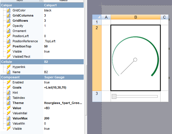
Super Gauge
Qubes 9.0 Gauge component with multiple skins.
Properties
| Property | Description |
| Enabled | Boolean indicating whether or not the component is enabled. |
| Hint | Specifies the user hint string that will appear in the component's interactive help bubble. |
| Goals | Optional array of values marked as goals on the gauge. |
| TabIndex | Integer indicating the component's tab order (Qubes 5.6). |
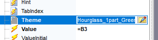
| Theme | Mandatory name of the wanted theme, can be seleced through a gallery |
| Value | Current value to display inside the circle. |
| ValueInitial | Determines the component's initial value when the screen opens and each time it is reset (see Reset Button). |
| ValueMax | Maximum value of the circle (100 by default). |
| ValueMin | Minimum value of the circle (0 by default). |
| Visible | Boolean indicating whether or not the component will be visible. |
Examples
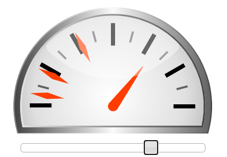
This component is made as a display window of different values, at no point it should alter values or return values for another component to read.
On the above screenshot, the gauges are set this way :
You can notice that the values in the list are not percentages but are placed on the right spot according to whatever you set between min and max values, in our example they are all in the first half of the gauge since our max is at 200 and our min at 0.
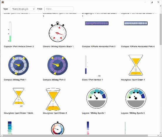
Theme selecting tool
When editing the theme property, you can press the icon on the right of the field to open a window and chose the gauge of your liking :
The selecting tool should look like this and give you a visual example of all the available gauges with some animations and goals set.
Remarks
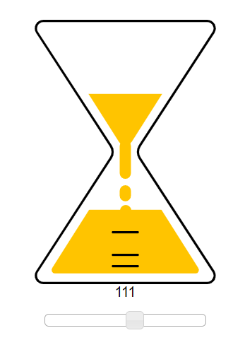
The themes are displayed using a mix of HTML and SVG which means that your cell could be scaled to any screen size and still look the way it should. Some themes contain features that others dont have, per example the hourglass theme also displays current values while a lot of others don't.