Button Styles
Different styles used by the new button component. They are embeded with the application and should not need any configuration. The style of your button changes according to the theme property value
JQueryUI Style
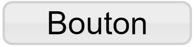
This is the style that is called when the theme property is empty or equals to 'jquery'. It is supposed to look visually like Qubes's previous default buttons.
Bootstrap 3 Styles

These styles are called using specific URLs, they are meant to look like Bootstrap 3's button style. the different URLs you can use are :
- bootstrap3 : Green themed button, also reffered to as the Success bootstrap 3 button
- bootstrap3:default : White themed button
- bootstrap3:primary : Blue themed button
- bootstrap3:info : Light-blue themed button
- bootstrap3:warning : Orange themed button
- bootstrap3:danger : Red themed button
- bootstrap3:#+ RGB hex value : Button theme taking a RGB Hexadecimal value and building a theme around it
Icon Only Style
This style can called by entering 'iconOnly' in the theme property. It only displays an icon as big as the cell can display it and hides the caption if any is entered. If your icon is not as big as the button, keep in mind that the cell's unfilled space is still clickable.
Empty Style
You can use this style by entering 'empty' in the theme property. It doesn't display anything else than the caption of your button. You can choose not to put a caption for your button to be invisible but clickable.
Custom SVG Styles
If none of these themes fit your page, you can create your own theme using a properly built SVG file. A tool is available to help you design your button. We reccommend that you check the SVG documentation (available here) in order to build your theme. You can learn how to host your theme (here).